Sunday, 16 September 2012

Exaltation

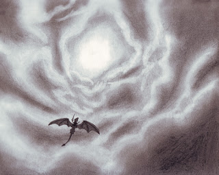
Greetings. Again it's been some time since my last entry, but there were several reasons for the delay... Anyway this is my latest finished artwork. It follows the style of my latest work but at the same time it is a step forward towards evolution.

The title is “Exaltation” and I wanted to confer this feeling on the focal point of the artwork which is the angelic being ascending to the sky. The setting is in a distant (or not so distant) future where an apocalyptic event occurs (what exactly I will leave to your imagination); hence the use of the crimson/red theme. I always thought that is such an event celestial beings such as her would be present. Several religions and cults have claimed an impending ending to the world as we know it, realised in various different ways and from various different views. This is how such an event would come to be; in my mind at least.

From a technical point of view in this artwork I worked on the background as much (if not more) as on the character. Compared to my other digital artworks this is by far the one I have spent the most time working on. About seven or eight separate sketches were drawn in order for the composition to be complete. All in all I feel this is my best digital work so far...


Saturday, 21 July 2012

Ex Chaos Ut Infinitio

These past two months in spite the lack of entries here, I have been working tirelessly on several projects. One of my main goals was to evolve artistically with emphasis given on artworks created 40% with pencil on paper and 60% on my pc digitally. I want to create a personal style; a fusion of traditional and digital drawing. I also decided to give more attention to the background and spend lots and lots of time on each artwork in order to achieve a higher level result.

The first "fruit of my labour" is the artwork shown below (expect more and better ones soon, as I have more projects in the making and I'm already working on them). It has a few different inspirations but the main one comes from a song of my favourite band (those who are familiar will understand). For the title I chose latin as I find this language epic and much to my liking.

Now the concept in my mind represents the act of rising above chaos and into eternity. I believe all of us face several problems in life, be they health, financial or emotional. So this artwork represents the act of overcoming such problems and reaching the happiness we all deserve. We must never give up on trying to reach that hapinness and above all; never lose hope.


Monday, 11 June 2012

Demolition Train - Kill Your Boss EP - New Edition

In light of the creation of the band's new logo and since the copies of the "Kill Your Boss" demo/EP were sold out, the guys decided to give something to the fans until the release of their first full length album. A new edition of it will be reprinted in a more proffesional and artistic way. This time a small booklet will be included with lyrics of the songs and portraits of the band members.

As it was decided on a whim there was not much time, but I worked to make a revamp of the initial artwork (this time using the new logo) and handle all the layout of the booklet and the album art as a whole. It was certainly a learning experience; one that will prove to be of value in my future endeavors too.

All in all the result is nice and the album feels now more like an EP rather than a demo. Anyway I decided to post the new version of the front cover here in remembrance of the completion of the project.

For those interested in the music of the band you can visit and contact them in their myspace page: http://www.myspace.com/demolitiontrain/music


Friday, 25 May 2012

Demolition Train - Brand New Logo


Well it's been a little more than a month since my last entry but it's not that I wasn't busy. I have a few projects in the making but it will take some time for them to be finalized and ready for publicity.

So returning to this new entry I would like to take a moment to remind you the metal band for which I had created their logo and the cover artwork for their first demo/ep. After a few talks with the guys we thought I give a try to create a new logo for them. This time I devoted more time on the project, researched other professional logos and even consulted a friend and fellow artist with experience on this area. The result is the logo you see below which will be from now on the official logo of the Demolition Train band. Personally I'm pretty satisfied from the result. It is 3d, it has depth and in my opinion it has nothing to be jealous of compared with other professional logos.

On a side note I'm currently working on the artwork for their first full length album. More news regarding that will follow in the future...


Wednesday, 18 April 2012

Phoenix

This is a very special painting for me both in terms of meaning and artistically. First of all it is the first painting where I used acrylic colours. Somehow the use of this type of colours felt right. And I believe the result shows for itself. I won't go into further technical details but acrylic colours seem to be my new medium of choice for my paintings.

Now leaving out the artistic talk, the subject of this painting is the fabled mythical fire bird, the Phoenix. A bird that has become a symbol of rebirth and renewal. Whenever it dies it burns completely; its ashes the only remains, only to rise again in a blaze of glory and defiance...

Saturday, 7 April 2012

Yin & Yang Pt2 - Draconian Blade

This is the second part of the Yin & Yang series and it is partially a concept revisited for me; at least visually. Dragons and a sword were used to convey the difference and the message. This time it is about Good/Evil, Light/Darkness.


Friday, 30 March 2012

Yin & Yang Pt1 - Pendant Of Moonlit Sunshine

This artwork was drawn with pencil and then coloured with a computer program. It is the first of a series of artworks I'll have with a certain theme. My choice is Yin & Yang and the differences it represents. In this first artwork I worked with a Sun/Moon, Day/Night contrast situated in a medallion.


Saturday, 24 March 2012

Autumnal

In this painting the initial idea was to draw a city on a huge tree. This concept was kept to some extent but evolved into a certain season's theme; hence my decision to name it as such. In the end I must say that I was very pleased by the colour theme I achieved and that this became one of my most favourite paintings so far...


Saturday, 17 March 2012

Whispers From The Elvish Woods

My affinity for the elves is common knowledge to those who know me. So this is my first oil painting with an elf as the main element.


Wednesday, 29 February 2012

Winter Fantasy Theme

Not a very complicated painting, but one fitting the end of the season...


Thursday, 16 February 2012

Thursday, 9 February 2012

Wondering What If

This is another oil painting. Technically it was one of the hardest and with a meaning not so apparent...


Friday, 3 February 2012

Gateway To The Elysian Fields

This is one of my favourite paintings. A gateway such as this exists for all of us to enter in our hearts...


Monday, 30 January 2012

The Lady And The Sword

This is one of the first oil paintings I have drawn. It was bought by my friend Daniela "Issy" from Germany.

Sunday, 15 January 2012

Demolition Train - Kill Your Boss

This is the Cover Artwork and Logo I made for the first demo cd of a greek speed/thrash metal band named Demolition Train...


Character Portraits of the "Sentinels of Shadows - Crossing Paths" Campaign

These are pics of some Artworks I made for an online Warhammer Campaign...


Some First Pics of Pencil Art by me...